
Product Type :
Concept project
Service Platform
Role and Duration :
UX Designer / End to end Product Designer
6 Weeks
Goal :
Help digitally inexperienced users complete essential everyday tasks safely and independently by reducing fear, confusion, and dependency on others.
Solution :
A multilingual learning platform with voice guidance, Safe Practice Mode, Guided Web Help, offline lessons, and trusted helper support to help users practise, recover from mistakes, and build confidence before using real apps.
At A Glance
Saarthi Learn is an interactive learning platform for digital newcomers, designed to teach essential tasks such as calling, payments, and accessing health information through simple, guided lessons. The experience uses voice support, large-button UI, minimal text, offline lesson access, and visual progress cues to make learning feel clear, safe, and approachable.
Problem
Low confidence digital users are unable to complete essential digital tasks independently because modern apps assume reading confidence, memory, trust, and error recovery skills they may not have.
Why this matters
→
→
→
→
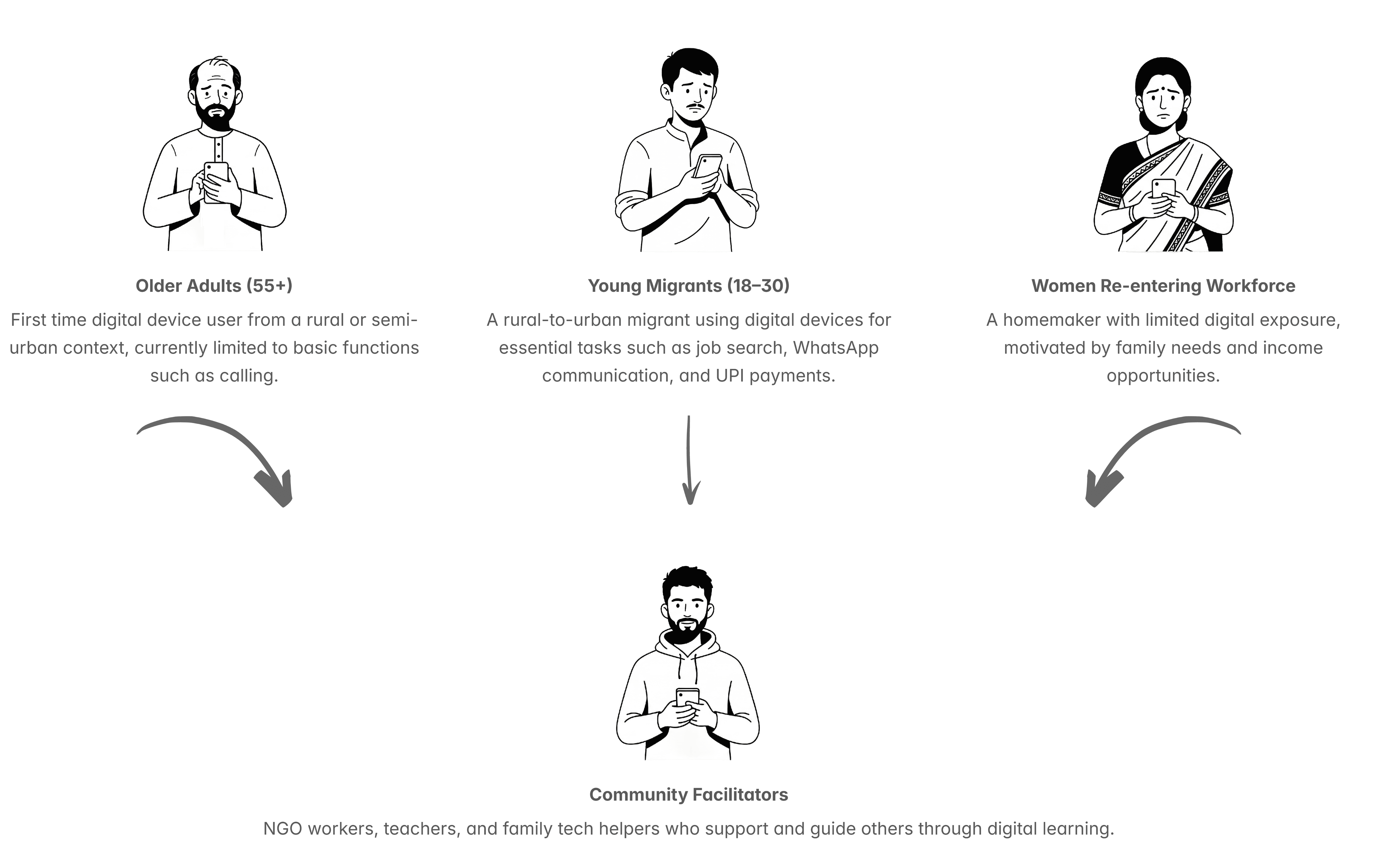
Identifying the target users
Primary users are low confidence digital learners who avoid essential apps due to fear of mistakes and low readability. Secondary users include family helpers and community facilitators who support onboarding, translation, and guided practice.
Synthesis
To move from observations to decisions, I grouped survey responses, and secondary research into recurring themes. This helped identify the barriers most consistently blocking users and clarified which design conditions the platform needed first.
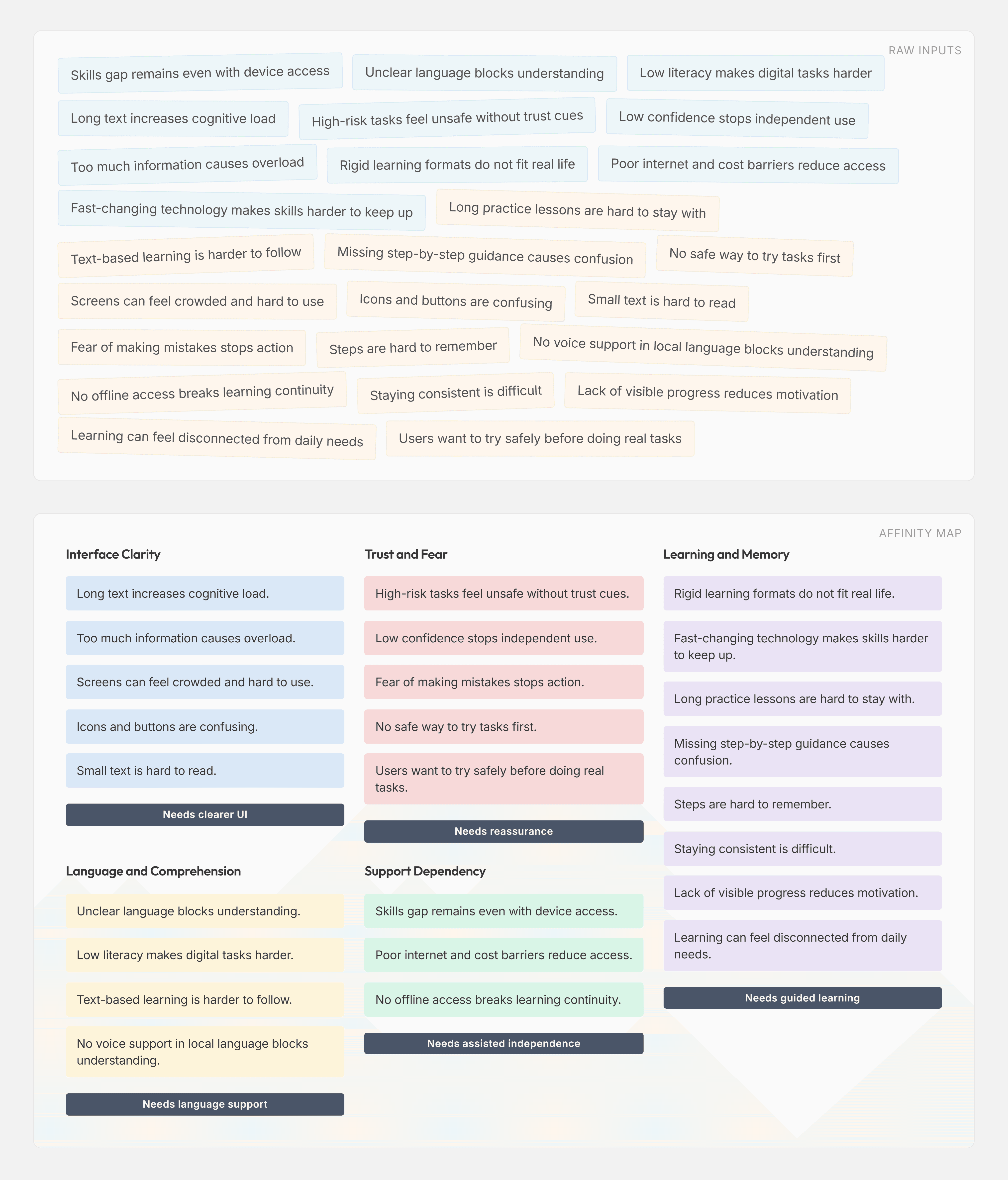
Pain Points and Needs
Users are not blocked by motivation alone. They are blocked by interface complexity, weak readability, unclear feedback, and fear of mistakes.
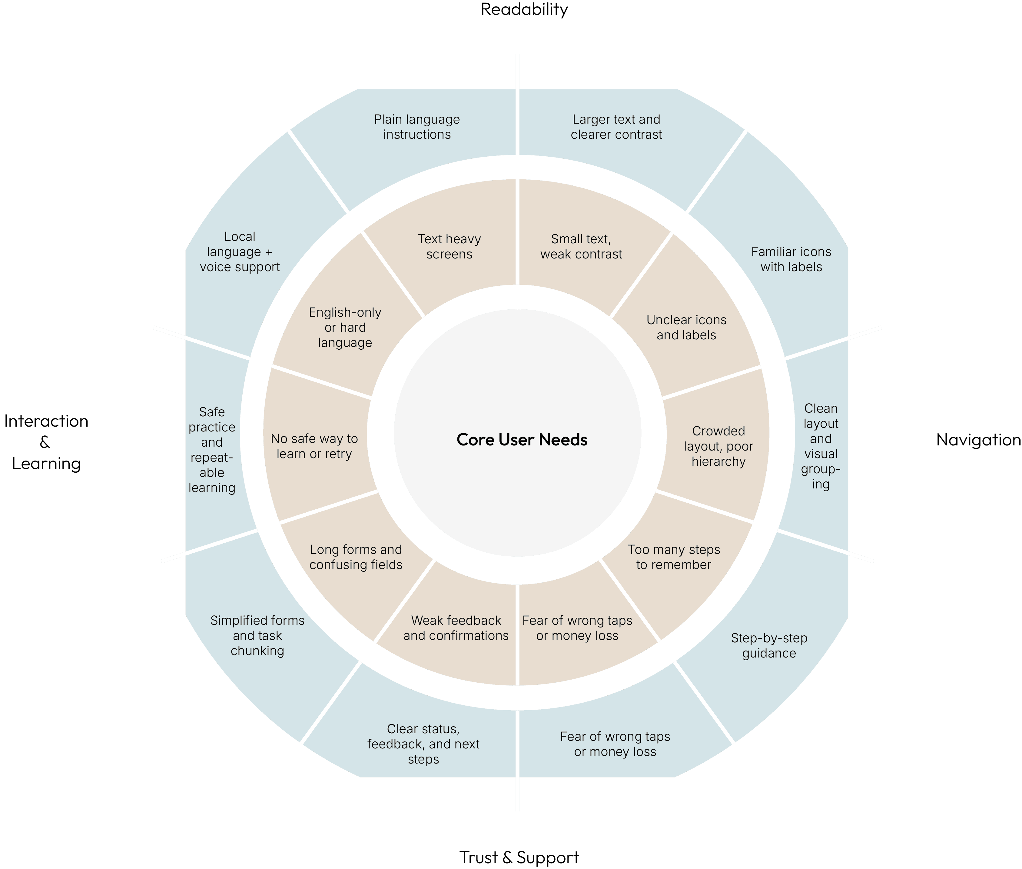
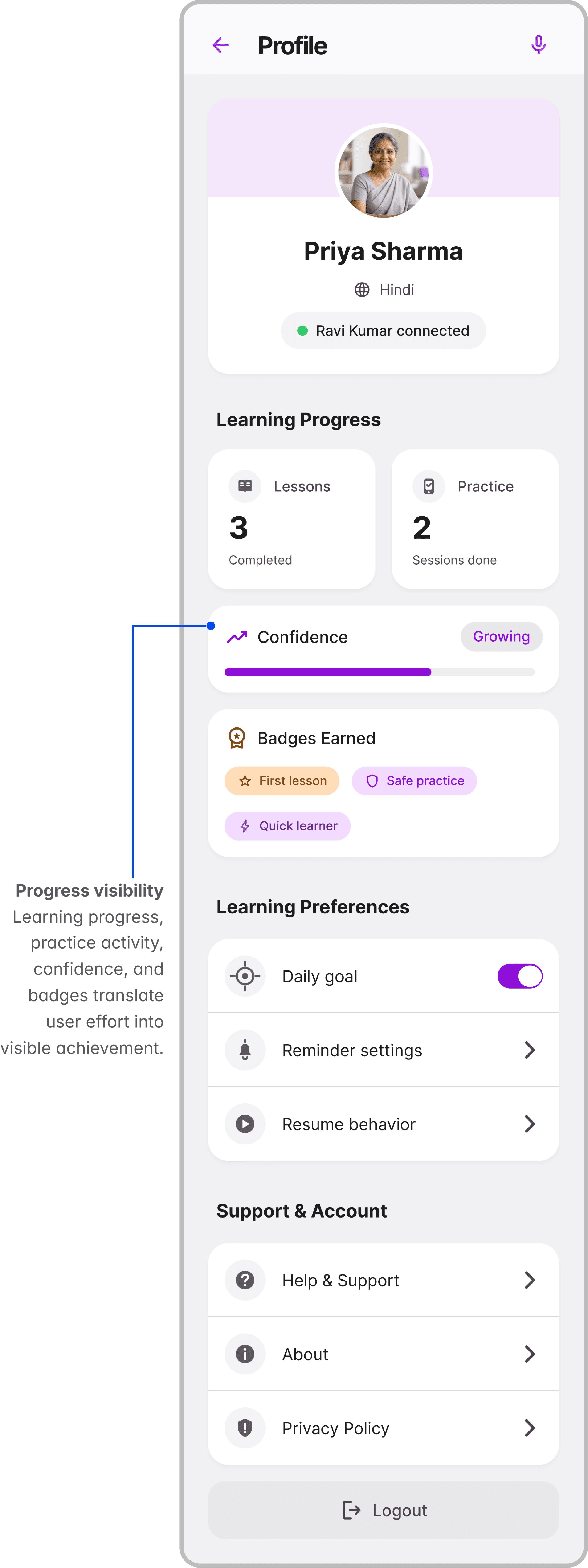
This diagram maps the interface and usability barriers that prevent low confidence users from completing essential digital tasks, and the support conditions needed to help them act with more clarity and confidence.
Feature Comparison Chart
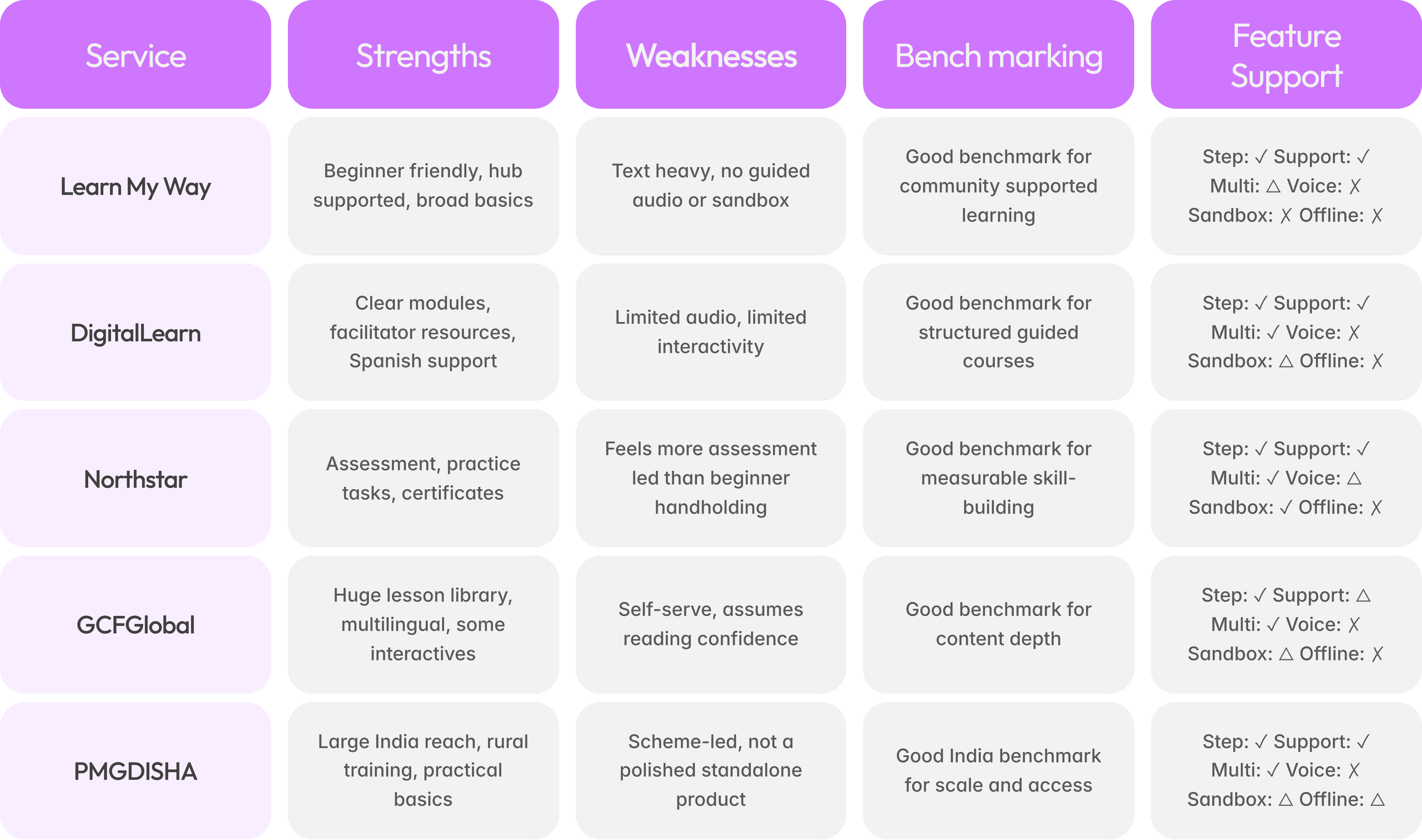
✓ Available, △ Partial / Limited, ✕ Not Available
MoSCoW
Trade offs:
I prioritised clarity, safety, and guided practice over adding a broad set of advanced features. Public forums, heavy gamification, VR/AR learning, and full live tutoring were deprioritised because they could increase cognitive load, privacy risk, and user dependency. I also kept progress tracking visible but secondary, so users felt supported without the experience feeling like an assessment. The MVP focused on the most critical user need: enabling low confidence users to practise safely, recover from mistakes, and build confidence before completing real digital tasks.
Mapping
Low and Mid fidelity Wireframes
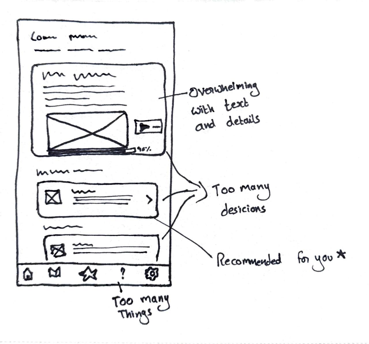
The first wireframe used a content heavy home screen to explain everything upfront. While the recommended lesson pattern was strong and retained, the overall layout introduced too many choices and too much information at once, increasing cognitive load.
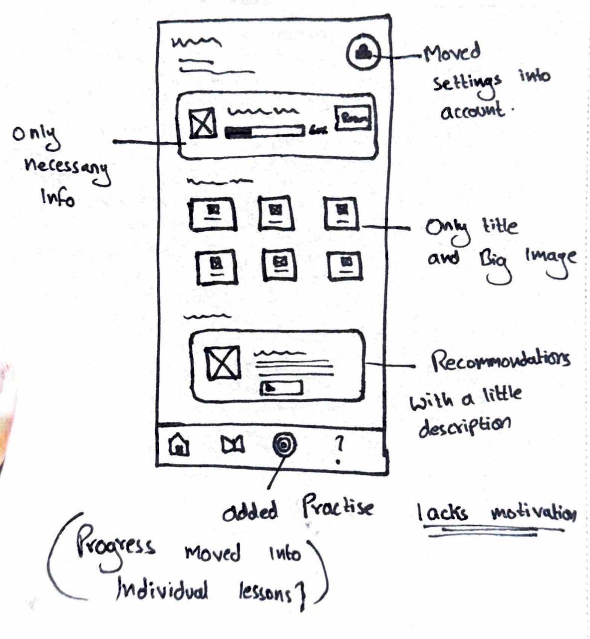
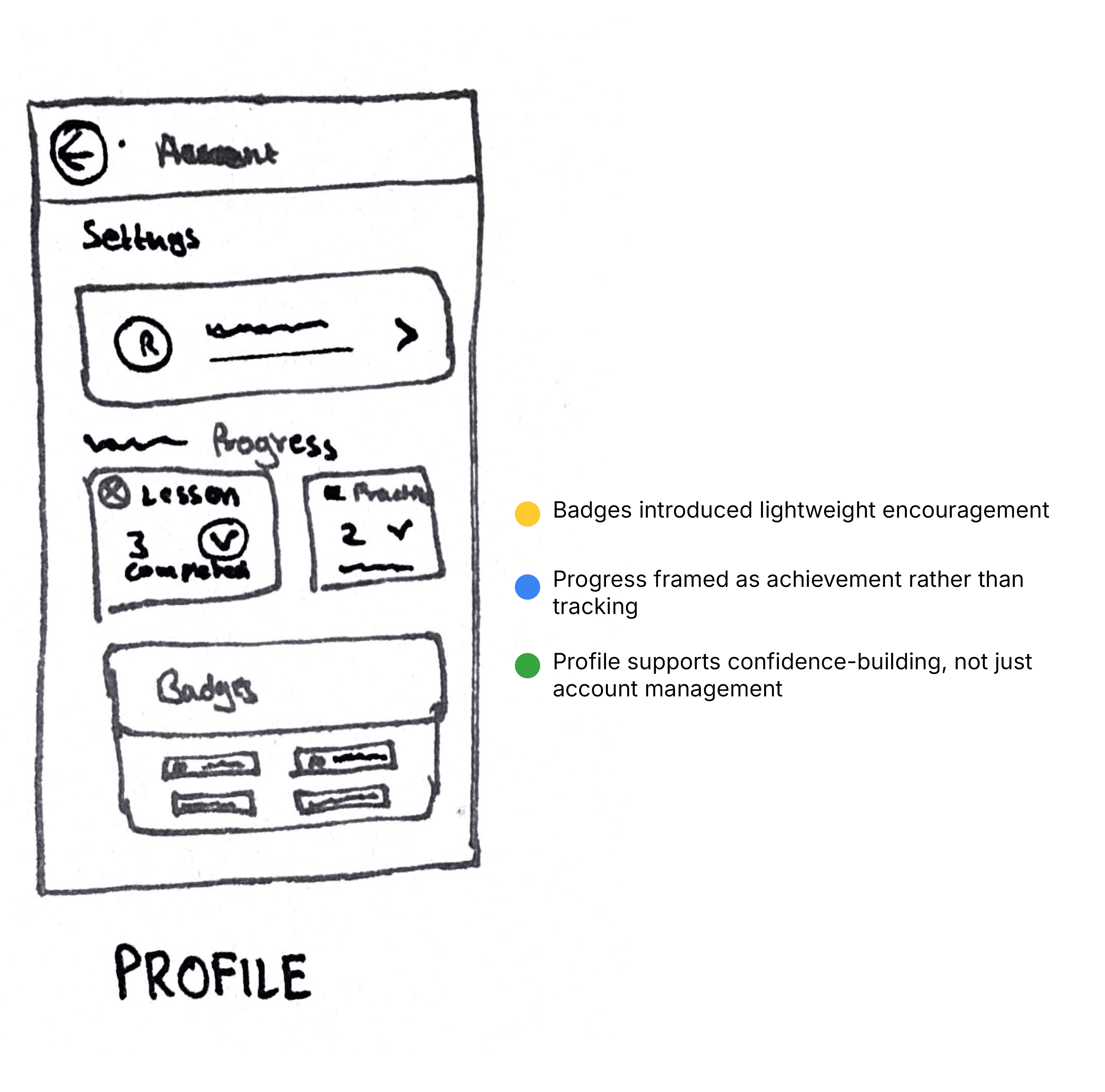
Simplified the interface to reduce cognitive load. Removed non essential text, moved settings to profile, shifted progress out of navigation, and added a dedicated Practice section. Clarity improved, but motivation still felt weak.
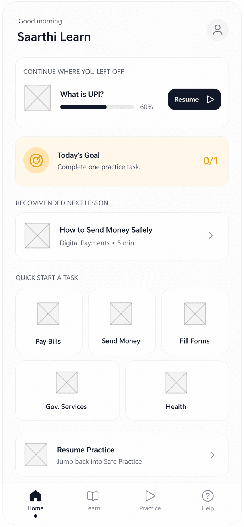
The final design brought back motivation without adding complexity. A Goals section gave users clearer purpose, while progress shifted to profile and became part of each lesson rather than a separate destination. This created a cleaner home screen and a more guided learning experience.
🟡 Simplified 🔵 Prioritized 🟢 Motivated
Final Design
Saarthi builds trust step by step: purpose first, language next, privacy reassurance, then optional helper support, keeping users informed without overwhelming them.
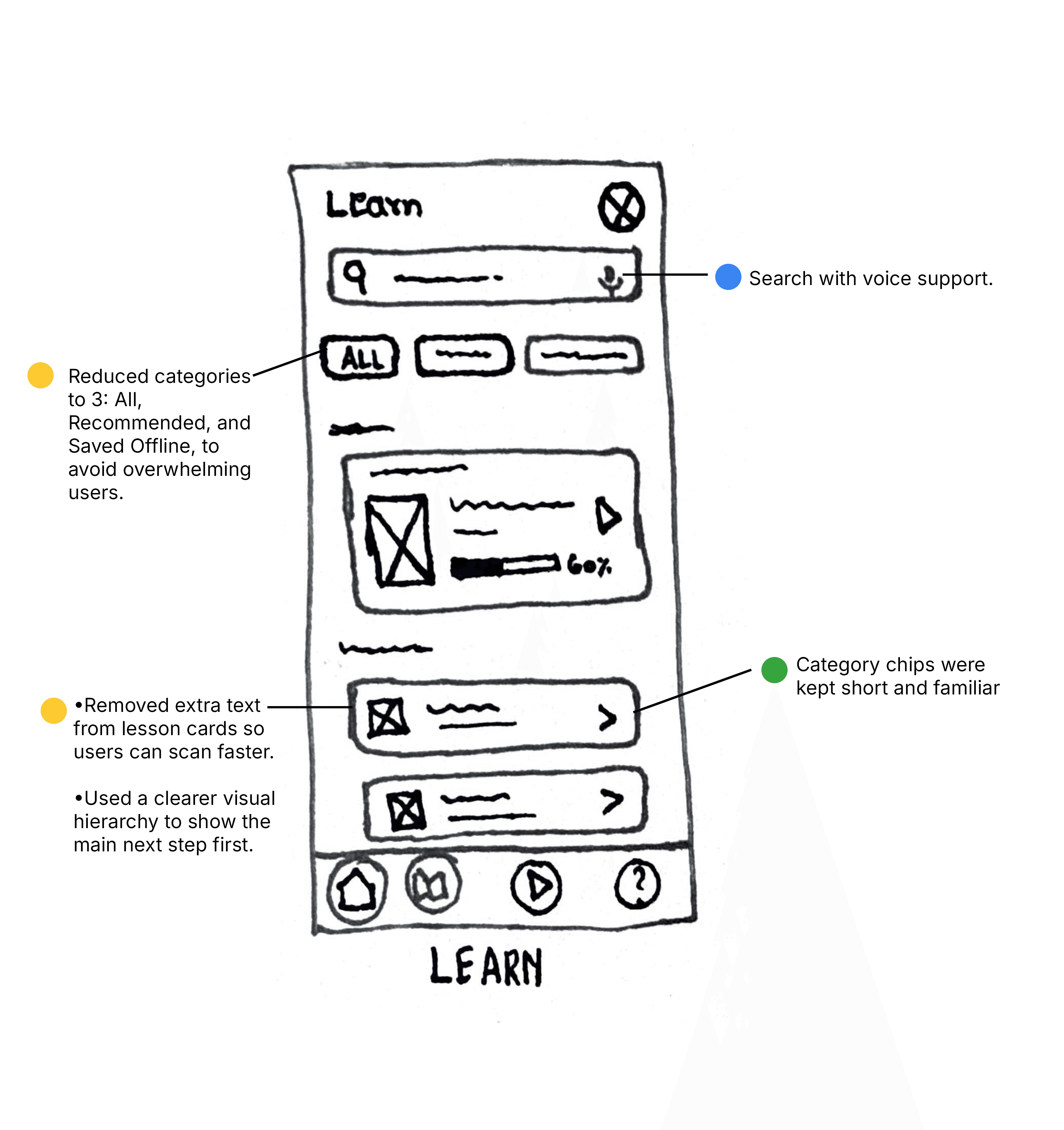
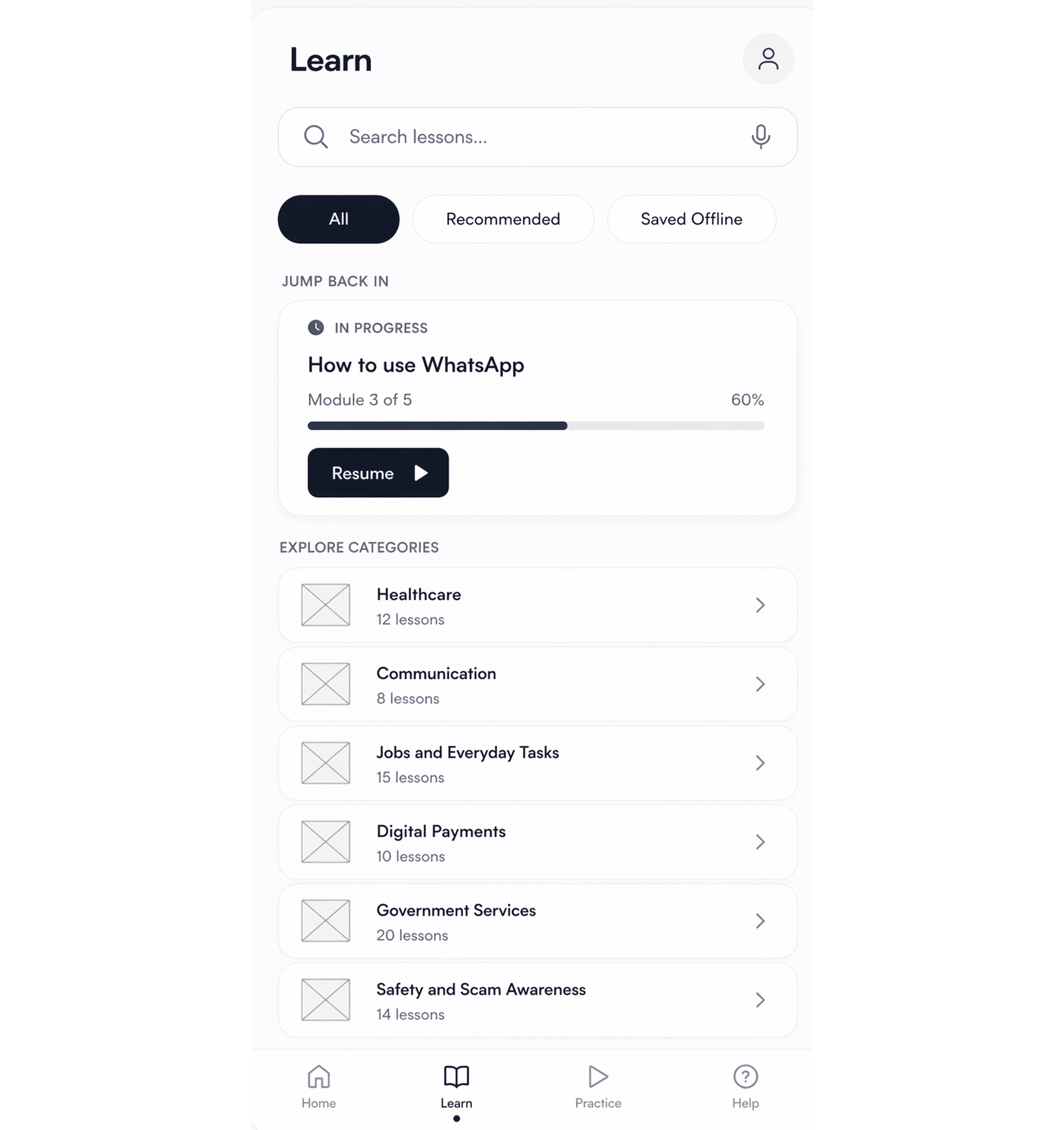
The Home and Learn screens use clear content hierarchy to prioritise continuity, goals, search, recommended lessons, and categories, helping users resume, discover, and learn with minimal cognitive load.
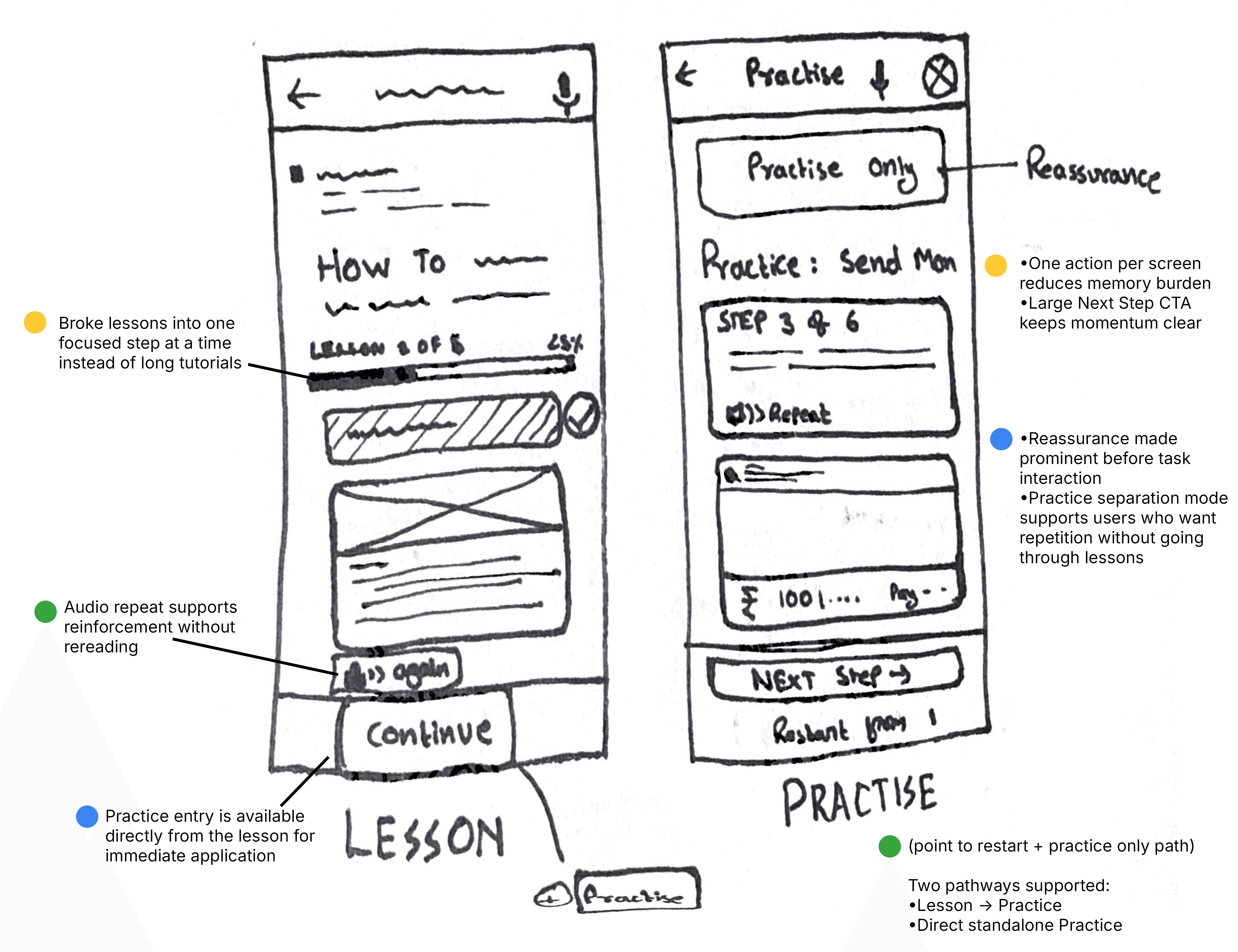
Progressive disclosure to move users from category selection to one guided lesson step at a time. Each screen reveals only what is needed next, while progress, recap, audio help, and practice prompts support confidence and reduce memory load.
The practice flow uses safe simulation, contextual guidance, and recoverable error states to support skill-building. Instead of blocking users after mistakes, Saarthi provides corrective cues and reassurance, helping users learn through action with reduced risk.
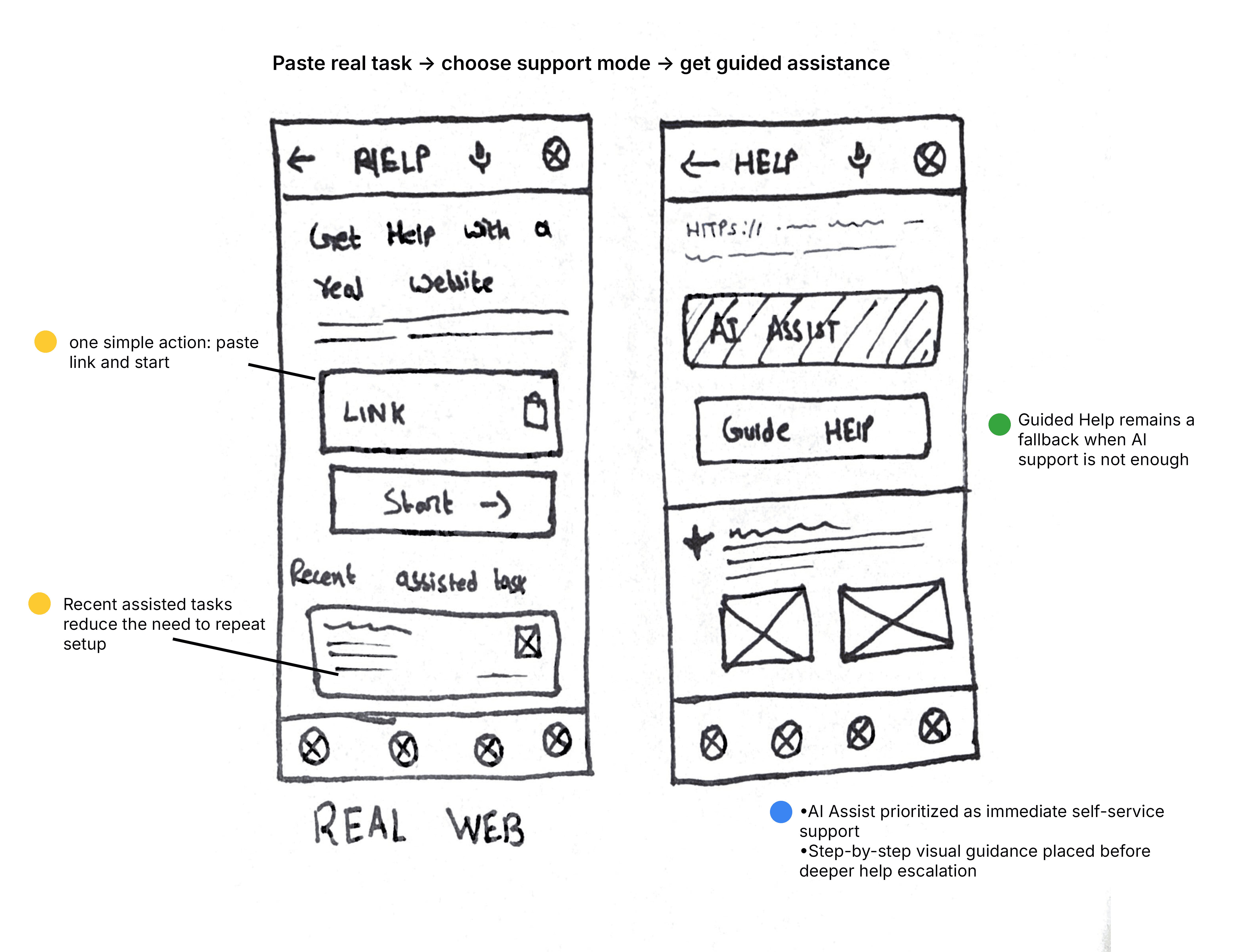
This flow uses assisted decision making and safety checkpoints to support users in high-risk external tasks. Saarthi interprets unfamiliar web pages, narrows attention to the next required action, and introduces human escalation or confirmation only at moments where user confidence or risk becomes critical.
Impact
Saarthi Learn reframes digital learning from “watch and remember” into “practise, recover, and build confidence.” The design directly addresses the core user problem: low confidence users avoid essential digital tasks because they fear errors, struggle with readability, and depend on others for support. By introducing Safe Practice Mode, voice guidance, simplified flows, offline lessons, and helper escalation, the product creates a safer path from assisted learning to independent task completion.
Because this is a concept project, these metrics have not been tested with real users yet. Instead, they define how the product’s impact should be validated in the next stage: first lesson completion rate, practice completion rate, confidence score before and after practice, reduction in helper dependency, guided-mode completion rate, and return usage for unfinished lessons.
Next Steps
Validate usability and confidence
Test the prototype with digitally inexperienced users to measure whether users understand the flows, complete tasks with fewer errors, and report higher confidence after practice.
Define measurable product success
Track activation from onboarding to first completed lesson, practice completion rate, confidence improvement, helper escalation rate, and repeat lesson usage to understand whether the product is moving users toward independence.
Assess MVP feasibility
Work with developers to evaluate the feasibility of AI guidance, voice support, offline access, real-app guided assistance, permissions, privacy safeguards, and trusted helper escalation before defining the first release scope.